Grupo
Solo project – discovery, UX/UI design, animation, prototyping, testing
The Problem
Grupo is a mobile application that I conceived and designed over a six week period as part of my UX Design Certificate at York University. The app concept was inspired by the increased need for alternative transportation during the COVID-19 pandemic and my observed apprehension of new cyclists riding in Toronto. I set out to investigate:
How might I help people get around by bike in a way that makes them feel safe, confident, and connected by community?
I personally gained confidence in the saddle by attending large group rides in Los Angeles, through the Midnight Ridazz forum. I was fortunate to discover that community through a friend, but finding out about group rides in any given city can be challenging, often limited to word of mouth. It can also be intimidating to show up for an unknown ride, especially for new riders.
Grupo was created with the goal of connecting all types of cyclists – new and experienced – to others in their community. I believe that creating a central platform for cyclists to find, join, and create rides (whether for commuting or pleasure) will help to increase the comfort level of new riders, as well as build and strengthen existing cycling communities across the world.
Product Design Strategy
To define the scope of the project, the core functions of the app were outlined:
allow people to create and share group rides with start times, meetup locations, and ride details,
allow people to browse rides in their area and sign up/save them,
allow communication of ride participants through commenting,
allow users to create profiles, add friends, and upload photos of rides,
and allow users to filter and tag rides to suit their preferences.
I began by creating user flow diagrams to map out the core interactions of the app, followed by some low-fidelity sketches. Then I used Figma to create mid-fidelity wireframes, and prototyped the Grupo experience so that I could obtain feedback from users early on.
Amalgamated User-Flows
Early Wireframes
Early Usability Testing
Moderated usability tests conducted virtually through Google Hangouts with 2 beginner cyclists, 2 intermediate riders, and 1 expert group ride host yielded valuable insights for consideration in the succeeding high-fidelity design. Each participant was asked to complete a series of tasks using a Figma prototype of the mid-fidelity wireframes, while thinking out loud as much as possible. A rainbow spreadsheet was used to record findings from each interview, and several patterns emerged, such as the unanimous request to call contacts “friends” instead of “connections”.
One of the most notable requests from this early test was from the experienced ride leader, who noted the importance of hosts being able to create a ride series, to reduce the need for inputting redundant ride details for rides that occur regularly. Ride legacy was another theme that emerged from riders of all levels – the expert ride leader wanting cumulative ride series maps, and new riders wanting the ability to add photos to ride pages. Better privacy control for ride leaders was also noted as being an important feature, rather than having each ride’s GPS data default to being publicly displayed in real time.
New riders expressed the need of encouragement tags such as “all welcome” if they were to consider showing up to an unknown group ride. Several participants also noted the inconsistent language between “saved rides” and “RSVPing” and the use of a heart icon to save rides proved to be confusing. “How can I like I ride I haven’t been on yet?” was one comment I received. The test group also preferred something closer to Facebook’s “interested in this event” over RSVPing, as it felt too committal, especially for newer riders.
As a result, I opted for creating simpler save/unsave buttons, animating a plus sign into a checkmark using AfterEffects and Lottie.
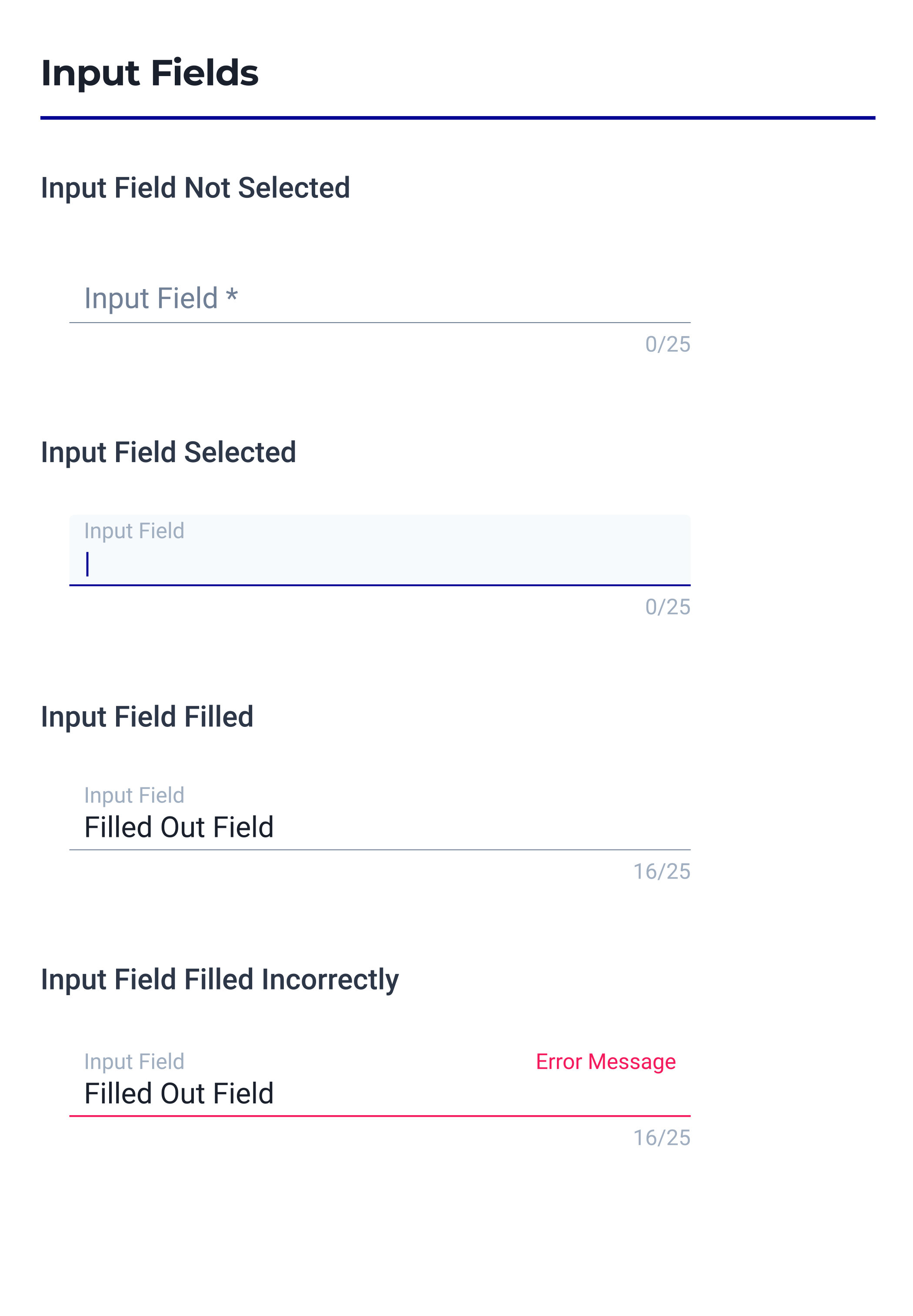
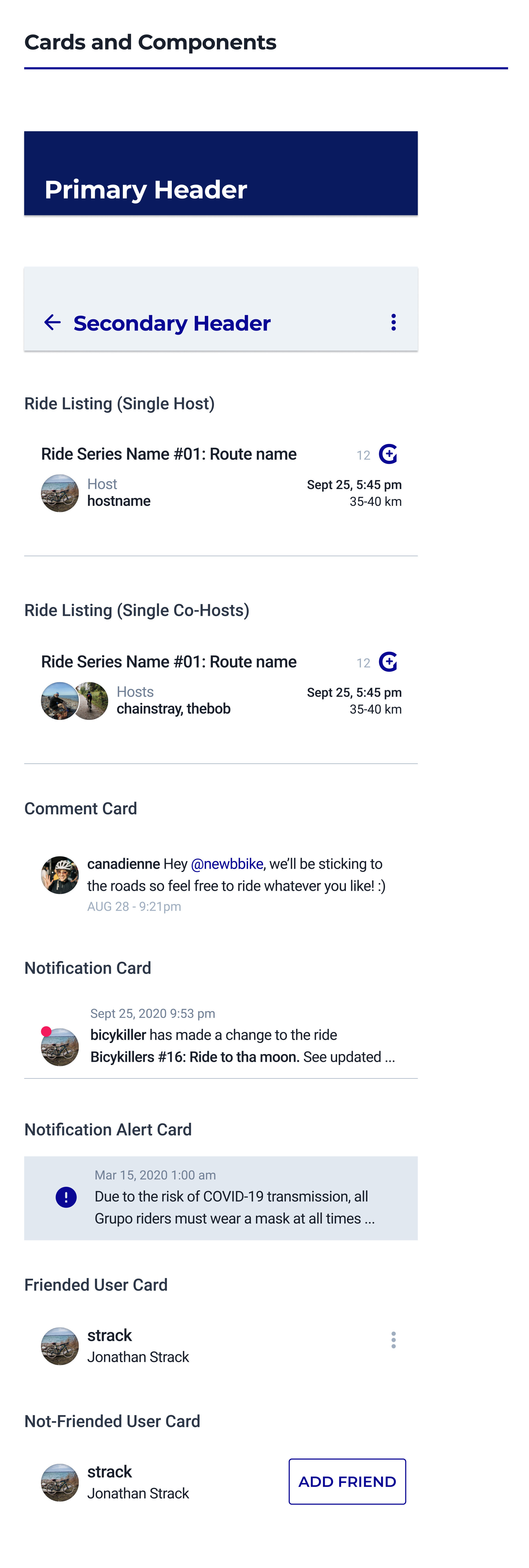
Style Guide
The style guide was developed in tandem with the next high-fidelity design and prototype. I wanted the user interface to remain fairly neutral with white and cool gray’s predominantly used in order to spotlight the content of the Ride Details pages and user photo uploads. The more vibrant colours in the palette are a nod to the night rides from which the Grupo concept was inspired, drawing inspiration from a darkening L.A. sky and glowing streetlights. The spirit of the brand is embodied by the loading animation which I animated in AfterEffects to enforce Grupo’s mission of community and strength in numbers – the G spinning into a wheel, and multiplying into 3.


High-Fidelity Usability Testing
Once the first high-fidelity prototype of Grupo was complete in Figma, a second round of usability testing was done using the Maze testing platform. I specifically wanted to test the ease of use of completing the application’s basic tasks, the effectiveness of the navigation, and the affordance of the “save ride” button.
A set of 5 tasks were created including: Creating an account, narrowing search results on the Find Rides page, saving a ride, creating a ride, and viewing photos (by navigating to the profile page).
The 11 participants were able to complete all tasks quickly and without trouble, whether directly or indirectly. While the quick completion of tasks and heat map information showed general success of the functionality of the Grupo app, some comments in the open ended questions implied that there was still work to be done. For example, one user found the Filters page overwhelming with the number of tags visible all at once. I revised the Filters page since then to include categories with drop-downs for tags instead of having all tags visible at once. I also created a custom set of icons to assist in the speedy identification of tag categories.
Sign In | Create Login | Profile Setup
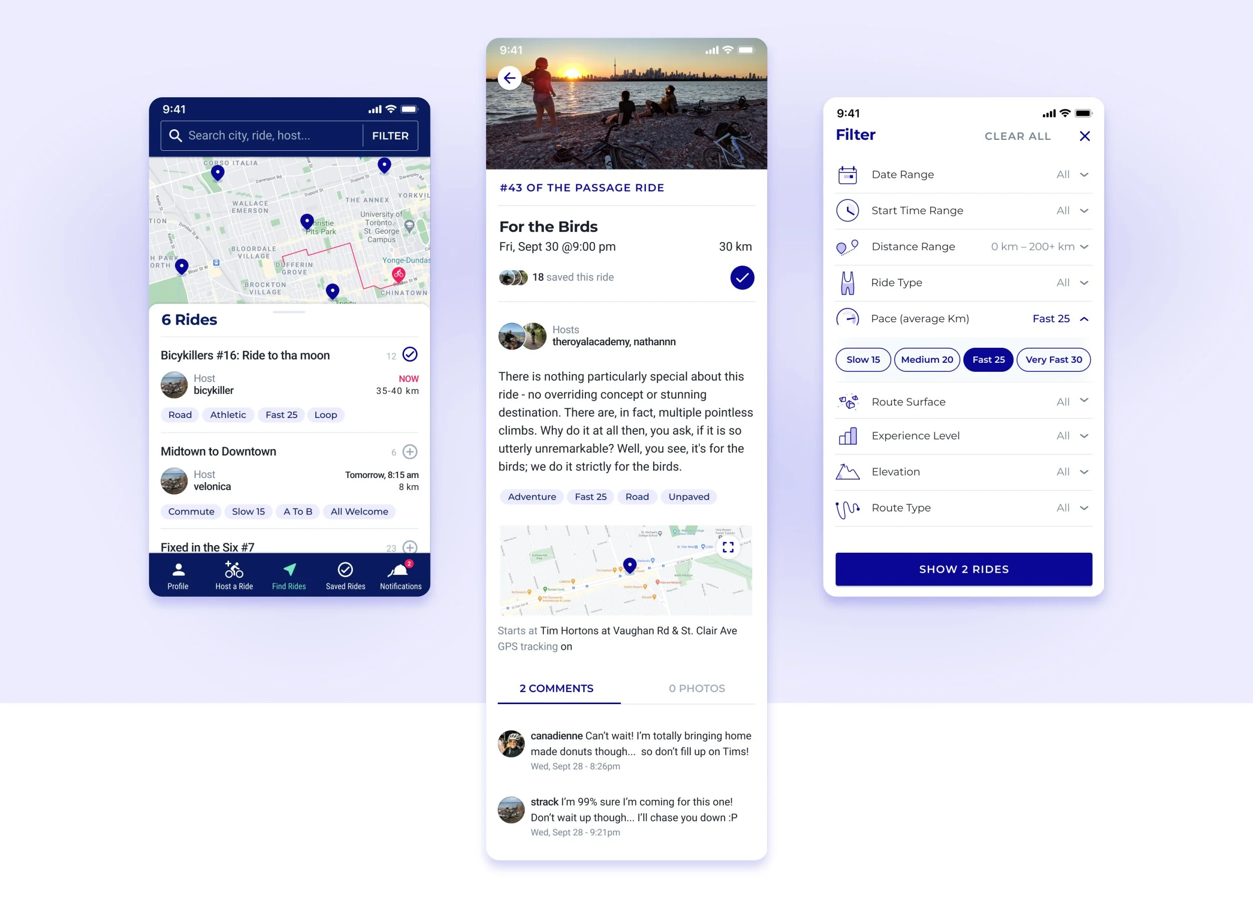
Find Rides Page – 3 Views
Ride Details | Series Details | Your Ride Details
Profile Page – 3 Views
Saved Rides | Notifications | Notification Details
Creating a Ride & Ride Series
Conclusion
Because of the six-week timeframe of this project, the Grupo application remains largely conceptual at this time. However, beyond my own belief in this innovative way to connect cyclists of all kinds to local group rides, I’ve also received a lot of enthusiasm for the app from others. Though it may be in its infancy, I really hope to continue developing this idea in the future.
Explore the prototype.