
Home Depot Canada
My role – research, design, prototyping, testing
Team: Liz Hayward, Jen Wallace, Gillian Eguaras
As part of the applied coursework for the Certificate in UX Design from York University, I was placed on a team of 3 students and paired with a real client – Home Depot Canada. We met with the Supply Chain team to explore problems relating to the online ordering experience, and in particular, the customer frictions encountered pertaining to delivery costs and times.
The Problem
Home Depot Canada’s supply chain has created innovative ways to ship products to customers in as little as 3-hours by shipping from a mix of large and small distribution centres, as well as local stores. The breadth of items available for delivery (from lightbulbs to lumber), and the differences in item origin, mean that delivery times and costs fluctuate greatly depending on the items in cart. Further complicating the experience is the difference in delivery options by item (some qualifying for express and scheduled delivery, and others not). The resulting checkout experience is confusing and often frustrating.
How can we improve the checkout experience for Home Depot customers, and improve transparency and control of shipping options and costs?
Research Overview
We set out to investigate:
What problems currently exist in the Home Depot checkout and delivery experience, and why do they occur?
How do competitors deal with similar challenges and how does Home Depot’s checkout and delivery experience compare?
What are the customer pain points of the online ordering experience?
What are customer expectations of delivery times and costs?
Over a four-week research period we completed a heuristic analysis of the current site, a competitive analysis of 3 leading retailers – which included a price & cost analysis to find areas in Canada where Home Depot excels and falls behind, as requested by the Supply Chain team. We also conducted four stakeholder interviews and three moderated usability tests with customers making an online purchase for delivery.
Research Findings
Overall, we gave 21 recommendations to improve the online ordering and delivery experience, broken into 5 themes: Communication, Navigation & Search, Website Design, Website Features, and Delivery & Pickup (last mile issues).
We also identified 3 areas of the user experience where user interface design choices could deliver quick solutions to some of these known and found issues. Our team split up to focus on each of these areas for the remaining two weeks of our project timeline. Gillian Eguaras concentrated on revising the product filters on the site to include free delivery, and express delivery as filtering options. Jen Wallace set out to revise the the product information pages, improving layout and clarity of information. I set out to improve the shopping cart.
The following case study outlines my process in the redesign of the shopping cart experience, and the final outcome.
Identified Issues
The following issues were identified in the design of the Shopping Cart currently in use:
Users with multiple items in their cart must manually change the delivery preference of each item, which is cumbersome, requires more time, and may lead to errors and omissions in delivery choices. For example, if a customer has four items in their cart and they want a scheduled delivery, they would need to select the appropriate scheduled delivery options four times, once for each item.
All items have shipping options listed next to them, even if other items have the same shipping options, creating unnecessary visual clutter. For example, if two items in a shopping cart both qualify for standard shipping and express delivery, the customer sees four options with toggle buttons instead of two.
Not all shipping options are visible as Scheduled Delivery & Express Delivery are grouped together as “Express Delivery - FLAT FEE”. This can cause confusion regarding what delivery options are actually available for an item.

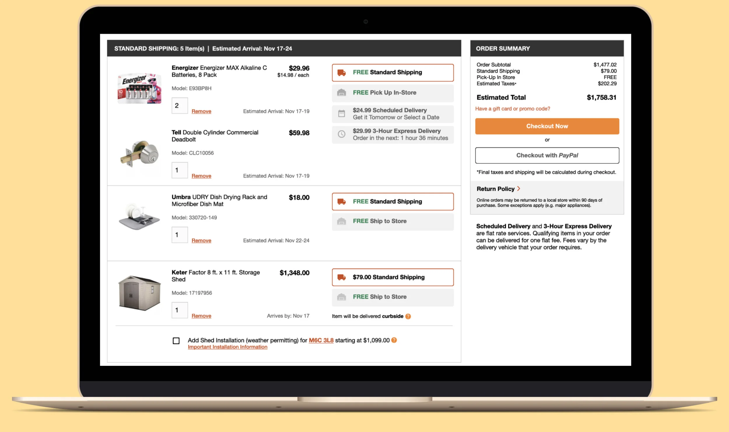
Home Depot’s Old Cart
“Express Delivery in our case could mean a scheduled delivery 2 weeks out, which is nothing ‘express’ about that.”
Shopping Cart Design Strategy
To address the issues listed above, my strategy was to find a design solution that would meet the following criteria:
Reduce time required to select Express delivery options by automatically applying delivery choices to all eligible items (not including those that would require additional shipping fees).
Reduce visual clutter and quicken delivery option selection by grouping items that have the same shipping options.
Improve transparency of delivery options by separating Express Delivery and Scheduled Delivery.
I began by sketching some rough concepts and translating them into mid-fidelity wireframes. The third concept was chosen as the design with most potential for significant improvement.
Mid-Fidelity Concepts
Final Design
I was able to group items with the same shipping options (reducing visual clutter and reducing time required to select items) by moving special information (i.e. Shipping dates, and number of items in stock) to the item card area, adjacent to the item photo, name, price, and quantity information.
I increased the transparency of delivery options by separating “Express Delivery – FLAT FEE” into the two very different options of Express Delivery and Scheduled Delivery.
I further distinguished all shipping options with the use of icons, for quick identification.
I abandoned the toggle buttons for larger rectangular buttons, improving the ease and speed of selection, especially for mobile users.
I also created a pop-up feature that would allow customers to know that eligible items were added to their delivery if they chose the express or scheduled options.
My New Cart
Home Depot’s Old Cart
Usability Testing Method
In order to test my assumptions about the new cart’s improvements, I created a usability test in Maze which featured 3 tasks to be completed in the new cart and the old cart. The test also asked participants about the ease of the 3 tasks in each cart experience, and their personal preference.
Task 1: Remove Costly Shipping Fee
Find the item in your cart that is costing you $79.00 in shipping fees and adjust your order so that you can pick up the item for free. Then hit the Checkout button.
Task 2: Change Your Order for Pick Up In-Store
In this scenario, assume you don’t want anything delivered, and you want to pick up all of the items in store, adjust your order and hit the Checkout button.
Task 3: Use Flat-Rate Express Delivery
In this scenario, assume that you need the batteries within the next 3-hours and are willing to pay the $29.99 shipping fee to get them. Change your delivery options so that the batteries get to you in 3 hours, along with any other eligible items included in the $30 shipping fee, and hit the Checkout button.
To reduce as much bias as possible in comparing the two shopping cart designs, I mocked up a faithful representation of the current shopping cart in Figma in addition to the high-fidelity prototype of the new design. This removed any chance of the Home Depot site loading times (an identified issue) affecting the test results. The prototypes had to be customized by task completion order, and participants were instructed to always work form the top of the page down when completing a task, in order to have the prototypes react as they would expect. The prototyping exercise alone showed how fewer clicks were needed in the new design versus the old one.
Cart A Prototype - My New Design
Cart B Prototype - Home Depot’s Old Design
Usability Testing Results
There were 11 people who participated in the dual usability test and survey. It’s important to note that participants completed tasks in the newly designed cart (Cart A) first, and Home Depot’s current cart (Cart B) second, so that any learning bias related to the tasks was in favour of the old design. With that in mind, the new cart performed extraordinarily well. The time to complete the 3 tasks was reduced on average by 5% , 28%, and 72% respectively.
Task 1:
Cart A - Average Duration: 37.6 seconds
Cart B - Average Duration: 39.7 seconds
Change in Duration: -5.29%
Task 2:
Cart A - Average Duration: 21.7 seconds
Cart B - Average Duration: 30.2 seconds
Change in Duration: -28.15%
Task 3:
Cart A - Average Duration: 26.5 seconds
Cart B - Average Duration: 93.7 seconds
Change in Duration: -71.72%
The vast improvement in the third task was largely due to the automatic addition of eligible items to express deliveries, allowing the customer to complete the task with 2 clicks, as opposed to the 13 clicks required in the same cart of items on the current website.

Pop-Up Notification of the Automatic Addition of Eligible Items
Furthermore, participants rated the ease of use of Cart A between 7 and 10 (with 10 being Very Easy), whereas the original Cart B was more undecided with more than half of participants rating between 3 and 5 on the scale.
Regarding which cart customers preferred, 9 out of 11 participants chose the new cart.
We concluded that by using our shopping cart design solution, Home Depot can clarify some of the complexities of their existing checkout experience and reduce the time and effort required by customers to complete their order. We hope that by applying a UX lens to the initial problems identified by the Supply Chain team, our solutions and research findings have helped to pave the way for improved customer experiences going forward.
“Cart B was found to be confusing. Had to really think when selecting and finding the correct options to include. Too much brain power was in use. Cart A felt more streamlined.”
— TESTER #22429738
“Info was more organized in option A, easier to associate the large buttons with each item vs the tiny radio buttons.”
— TESTER #22413007
“The Cart A process seemed to have fewer clicks/scrolling.”
— TESTER #22432226